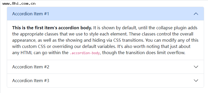
结合我们的 Collapse JavaScript 插件构建垂直折叠的手风琴。工作原理手风琴在内部使用 collapse 来使其可折叠。若要呈现展开的折叠项,请在.accordion 上添加 .ope
结合我们的 Collapse JavaScript 插件构建垂直折叠的手风琴。
工作原理
手风琴在内部使用 collapse 来使其可折叠。若要呈现展开的折叠项,请在.accordion 上添加 .open 类。

<div class="accordion" id="accordionExample">
  <div class="accordion-item">
    <h2 class="accordion-header">
      <button class="accordion-button" type="button" data-bs-toggle="collapse" data-bs-target="#collapseOne" aria-expanded="true" aria-controls="collapseOne">
        Accordion Item #1
      </button>
    </h2>
    <div id="collapseOne" class="accordion-collapse collapse show" data-bs-parent="#accordionExample">
      <div class="accordion-body">
        <strong>This is the first item's accordion body.</strong> It is shown by default, until the collapse plugin adds the appropriate classes that we use to style each element. These classes control the overall appearance, as well as the showing and hiding via CSS transitions. You can modify any of this with custom CSS or overriding our default variables. It's also worth noting that just about any HTML can go within the <code>.accordion-body</code>, though the transition does limit overflow.
      </div>
    </div>
  </div>
  <div class="accordion-item">
    <h2 class="accordion-header">
      <button class="accordion-button collapsed" type="button" data-bs-toggle="collapse" data-bs-target="#collapseTwo" aria-expanded="false" aria-controls="collapseTwo">
        Accordion Item #2
      </button>
    </h2>
    <div id="collapseTwo" class="accordion-collapse collapse" data-bs-parent="#accordionExample">
      <div class="accordion-body">
        <strong>This is the second item's accordion body.</strong> It is hidden by default, until the collapse plugin adds the appropriate classes that we use to style each element. These classes control the overall appearance, as well as the showing and hiding via CSS transitions. You can modify any of this with custom CSS or overriding our default variables. It's also worth noting that just about any HTML can go within the <code>.accordion-body</code>, though the transition does limit overflow.
      </div>
    </div>
  </div>
  <div class="accordion-item">
    <h2 class="accordion-header">
      <button class="accordion-button collapsed" type="button" data-bs-toggle="collapse" data-bs-target="#collapseThree" aria-expanded="false" aria-controls="collapseThree">
        Accordion Item #3
      </button>
    </h2>
    <div id="collapseThree" class="accordion-collapse collapse" data-bs-parent="#accordionExample">
      <div class="accordion-body">
        <strong>This is the third item's accordion body.</strong> It is hidden by default, until the collapse plugin adds the appropriate classes that we use to style each element. These classes control the overall appearance, as well as the showing and hiding via CSS transitions. You can modify any of this with custom CSS or overriding our default variables. It's also worth noting that just about any HTML can go within the <code>.accordion-body</code>, though the transition does limit overflow.
      </div>
    </div>
  </div>
</div>粉丝
0
关注
0
收藏
0